You launch a new batch of creatives on Meta. The hooks are solid, the offer is proven, the copy is clean, and the campaign still underdelivers because the video was exported in the wrong shape, uploaded into the wrong placement mix, or cropped badly enough that the product demo disappears under the interface.
That problem is bigger than a simple spec mismatch. It affects how much screen space your ad gets, how native it feels in-feed, how clean it renders after compression, and how much time your team burns sorting versions across ad sets. For buyers running volume, Facebook video ads size isn't a design footnote. It's an operations issue tied directly to speed, consistency, and spend efficiency.
Table of Contents
- Why Your Facebook Video Ad Specs Are Costing You Money
- The Quick Reference Cheat Sheet for 2026
- Core Technical Concepts That Directly Impact Performance
- Placement Deep Dive Feed and Marketplace
- Placement Deep Dive Stories Reels and Vertical Video
- Handling In-Stream and Other Niche Placements
- Solving the Multi-Format Workflow Bottleneck at Scale
- Your Go-To Video Export Settings and Final Checks
Why Your Facebook Video Ad Specs Are Costing You Money
A lot of bad Meta performance gets blamed on targeting, offer fatigue, or bid strategy when the actual issue is simpler. The asset doesn't fit the placement it's being served in.
Meta's own guidance is explicit. Facebook Feed supports 1:1 and 4:5, with a recommended minimum of 1080 × 1080 pixels, while 9:16 is recommended for Stories, Status, and Reels, and 16:9 is recommended for in-stream video, according to Meta's video ads guide. That matters because “Facebook video ads size” isn't one universal file spec. It's a placement decision.
If you ignore that, you create three avoidable problems:
- You lose screen real estate: A weak-fit aspect ratio takes up less space or gets padded awkwardly.
- You signal “ad” too fast: Users notice letterboxing, bad crops, and template-looking assets immediately.
- You slow your team down: More manual edits, more duplicate exports, more placement cleanup in Ads Manager.
Practical rule: Treat video sizing as part of media buying, not just creative production.
The teams that scale cleanly usually do one thing right. They decide placement first, then build the file around that environment. Feed creative should behave like feed creative. Vertical placements should feel native to full-screen viewing. In-stream should match the surrounding video context instead of fighting it.
That's the difference between a spec-compliant asset and a deployable one. One merely uploads. The other survives delivery, previews correctly, and gives the ad a fair shot.
The Quick Reference Cheat Sheet for 2026
A fast spec check saves real money here. The wrong ratio does not just look off in preview. It creates extra exports, extra QA passes, and extra placement exclusions that eat into margin once you are handling multiple ad sets and creative variants at the same time.
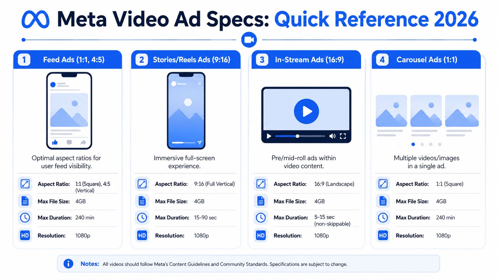
| Placement | Best-fit aspect ratio | Practical working resolution | Max file size | Duration guidance |
|---|---|---|---|---|
| Feed | 1:1 or 4:5 | At least 1080 × 1080 | 4 GB | 1 second to 241 minutes |
| Stories | 9:16 | Build vertically for full-screen delivery | Keep files light enough for fast upload and review | Short, fast, mobile-native cuts usually fit best |
| Reels | 9:16 | Build vertically for full-screen delivery | Keep files light enough for fast upload and review | Short edits usually fit the environment better |
| In-stream video | 16:9 | Match the surrounding landscape video context | Keep files efficient to avoid slow handoff and processing | Tighter edits usually perform better than long-form |
| Carousel video | 1:1 | Square-first creative is usually the safest starting point | Keep each asset lightweight | Make each card understandable on its own |
Use this table as an ops sheet, not just a design reference. A buyer deciding how many versions to request should care about the same inputs as the editor exporting files. If the placement mix includes Feed, Reels, Stories, and in-stream, one master file is rarely enough. Three format families usually cover the account cleanly: square or 4:5 for feed-style inventory, 9:16 for vertical inventory, and 16:9 for in-stream.
The hard constraints worth remembering are simple. Feed gives you the clearest published limits, so it is the easiest baseline for production planning. As noted earlier, Feed supports 1:1 and 4:5, with 1080 × 1080 as a practical minimum working resolution. It also allows long runtimes and files up to 4 GB, which matters less for strategy than for upload speed, review friction, and version control.
How to read this table
Do not weigh every column the same way.
- Aspect ratio decides fit first. If the frame does not match the placement, nothing else in the file matters much.
- Working resolution protects against ugly compression. Start with enough pixels to survive Meta's processing and still look clean on mobile.
- File size affects operations. Oversized exports slow uploads, approvals, and handoffs between creative and paid teams.
- Allowed duration is not a performance recommendation. A placement can technically accept long video and still punish it in real delivery.
Good media buying teams separate platform eligibility from production standards.
The practical rule is straightforward. Build and name separate masters by placement family from the start. That cuts manual sorting later, reduces accidental mismatches in Ads Manager, and gives the team a cleaner path to scale without turning every launch into a resizing project.
Core Technical Concepts That Directly Impact Performance
Specs affect delivery before the auction has a fair shot. A strong concept can still lose if the file enters the wrong placement family, gets cropped badly, or turns soft after upload.
That is why good teams treat sizing as an operations problem, not a design footnote.
Aspect ratio changes both visibility and production load
On mobile feed, a 4:5 video occupies more vertical real estate than 1:1. That usually gives the creative a better chance to stop the scroll. 1:1 still earns its place when desktop matters, when the same ad has to hold up across mixed feed inventory, or when the team needs one stable version for fast testing.
The trade-off is practical, not theoretical. Every extra ratio you support can improve fit, but it also adds editing time, QA time, naming complexity, and more room for the wrong file to get attached in Ads Manager. Teams that ignore that cost often end up with a messy library full of near-duplicates and inconsistent previews.
Across Facebook placements, ratios range from 16:9 to 9:16. The working rule is simple. Use 1:1 or 4:5 for feed-style inventory, 9:16 for Stories and Reels, and 16:9 for in-stream placements, as noted earlier. The mistake is trying to force one master into every surface and hoping auto-cropping will clean it up. It rarely does.
Compression exposes bad workflow choices
Compression problems usually start upstream. Low-bitrate exports, variable frame rate files, and recycled edits from another channel may look acceptable in the editor preview, then break down once Meta processes them.
The fix is boring and profitable. Export a clean master first, then derive placement versions from that source instead of resizing already-compressed files. In practice, that means keeping enough resolution in the working files so text edges, product details, and UI captures stay readable after upload. For many teams, that means producing masters above the bare minimum rather than treating the minimum as the target.
Manual handling is where this gets expensive. If a buyer or editor has to sort through square, 4:5, full-vertical, and wide-format versions by hand every launch, mistakes pile up fast. A wrong upload can waste spend for hours before anyone notices. At scale, that drag matters as much as the creative itself.
Use these production standards:
- Keep on-screen text thick and readable on a phone: thin fonts and low-contrast overlays are usually the first elements compression ruins.
- Protect the edges of the frame: logos, captions, price points, and CTAs need safe padding because different placements and UI layers eat into visible space.
- Export with clean technical settings: H.264, fixed frame rate, progressive scan, and square pixels reduce preventable rendering issues.
- Build for silent viewing first: feed placements often autoplay without sound, so the opening message has to land visually.
If the offer is only clear with audio on, the ad is fragile.
Buyers usually focus on hooks, angles, and thumb-stop rate. Those matter. But file quality, ratio discipline, and a repeatable versioning process decide whether the audience sees the ad the way the editor intended, or a compressed compromise that underperforms for avoidable reasons.
Placement Deep Dive Feed and Marketplace
A campaign launches on Friday afternoon. The editor exported one square file, the buyer left placements broad, and by Monday the mobile-heavy ad set has spent real money on a version that never took full advantage of the screen. That is a common failure point in Feed and Marketplace. It is not a creative strategy problem. It is an ops problem.

For Feed and Marketplace, the file specs are usually easy to satisfy. The harder part is choosing the right working ratio for the traffic mix you are buying. Feed can support square and taller formats well. Marketplace usually responds to the same discipline. Clear product framing, readable text, and a layout that still makes sense in a fast mobile scroll.
When 1 to 1 still makes sense
Use 1:1 if the campaign needs one feed asset that behaves predictably across desktop and mobile. Square is still the lower-risk option for broad delivery, especially if the account structure does not separate mobile-heavy ad sets from everything else.
I keep 1:1 in rotation for a few specific cases:
- Desktop-inclusive campaigns: the composition holds up without awkward cropping.
- Product demos with side-by-side elements: square gives enough width to keep both subjects readable.
- Fast testing cycles: one square master cuts down version management when the team is launching a lot of variants.
A practical export target is 1080 × 1080 or higher. The main advantage is workflow control. One clean square master is easier to QA, easier to label, and less likely to get mixed up in the upload queue when multiple editors and buyers are touching the same campaign.
When 4 to 5 earns the extra production time
Use 4:5 when mobile feed is driving the spend and the ad needs more visual weight in the scroll. That extra height usually gives the hook more room to work. It also gives subtitles, product shots, and creator framing more space without forcing tiny text.
4:5 tends to outperform square in these setups:
| Better suited to 4:5 | Usually weaker in 4:5 |
|---|---|
| UGC talk-to-camera | Wide product montages |
| Single-product demos | Complex horizontal layouts |
| Before-and-after framing | Small legal text blocks |
| Founder or creator hooks | Multi-column visual designs |
There is a trade-off. 4:5 creates more work if your team is still managing exports manually. Every extra ratio means more filenames, more handoff steps, more chances to upload the wrong asset, and more time spent checking previews instead of building the next test. That is manageable for a small account. It gets expensive fast across dozens of ad sets and multiple clients.
Marketplace follows the same general rule as Feed, but the creative usually needs to feel simpler and more immediate. Shoppers there are scanning listings, prices, and product imagery. Ads that look too polished or overly designed can feel out of place. Straightforward product visibility usually beats fancy editing.
The mistake newer buyers make is choosing square by default because it is easier to manage. The mistake experienced teams make is producing 4:5 for everything without checking where delivery is landing. The profitable setup is tighter than either extreme. Match the ratio to the placement mix, build naming conventions that prevent upload errors, and standardize the versions your team creates every time. That is how you protect performance without turning creative ops into a bottleneck.
Placement Deep Dive Stories Reels and Vertical Video
A lot of wasted spend starts here. The team uploads one square cut, checks the auto-placement box, and assumes Meta will sort it out. The campaign runs, but Stories and Reels get a version that looks cropped, cramped, or off-center. CTR drops, hold rate drops, and nobody notices until the weekly review.
Vertical placements are less forgiving than Feed because the ad takes over the screen. Every framing mistake gets bigger. If the first second looks recycled, the viewer reads it as low-effort creative and keeps moving.
Why 9:16 should be the production default
For Stories, Reels, and other full-screen mobile placements, 9:16 is the working format to build around. As noted earlier, Meta recommends vertical treatment for these surfaces. In practice, teams usually keep a high-resolution vertical master such as 1440 × 2560 so compression and minor placement adjustments do less damage.
The goal is not only technical compatibility. It is placement fit.
A 1:1 asset can still deliver, but it often leaves dead space or forces the app UI to compete with the message. A 16:9 cut usually performs even worse unless the creative was designed to survive aggressive reframing. The viewer can tell when the ad started life somewhere else.
What vertical placements reward
Stories and Reels usually respond best to creative built with mobile behavior in mind:
- Immediate movement in frame: Static openings lose attention fast.
- One clear message: One product, one offer, one angle.
- Large readable text: Mobile-safe, thick enough to survive compression.
- Centered composition: The subject and hook need to hold up inside a narrower safe area.
- Fast visual payoff: Show the product, result, or transformation early.
That last point matters more than many creative teams admit. Vertical placements move quickly. If the payoff comes too late, the edit may look polished and still fail.
The overlay problem that breaks good edits
Stories and Reels have UI elements sitting on top of the creative. Captions, profile details, buttons, and response prompts all compete for space. Editors who place logos at the top edge or CTAs at the bottom edge often cover their own message.
The fix is operational, not theoretical. Build with a safe middle zone every time.
Keep the face, product, opening hook, and key proof point away from the edges. If subtitles are required, keep them high enough to avoid bottom UI but low enough to stay tied to the speaker. This sounds minor until you are managing 40 to 100 active creatives and half the account is spending in vertical placements. Then one bad template can drag down a lot of budget.
A production workflow that holds up at scale
Teams that handle this well do not resize at the end and hope for the best. They set up a repeatable vertical workflow from the start:
- Cut a native 9:16 master first. Start with the placement that has the tightest framing rules.
- Protect the middle of the frame. Assume the top and bottom will get crowded by UI.
- Design text for phone screens, not editing software previews. If it feels slightly oversized on desktop, it is often right on mobile.
- Export with version control built in. Clear filenames by ratio and placement family reduce upload mistakes.
- Check actual mobile previews before launch. A clean timeline does not guarantee a clean placement render.
The workflow angle matters. Manual resizing sounds manageable at low volume. It gets expensive once every campaign needs Feed, 4:5, and vertical versions, plus revisions for hooks, offers, and creators. The time loss is obvious. The hidden cost is performance drag from wrong-file uploads, rushed crops, and edits that were never meant for full-screen use.
For Reels and Stories, the common failure is not rejection by the platform. It is shipping creative that technically fits but feels misplaced. In a full-screen environment, that mistake shows up fast in thumb-stop rate, watch time, and CPA.
Handling In-Stream and Other Niche Placements
A lot of wasted spend starts here. The account is set to broad placements, the creative team exports feed and vertical files, and in-stream gets the leftovers.
That usually means a 1:1 or 4:5 asset is forced into a placement built around a 16:9 version. Meta may still deliver it, but the ad looks out of place inside a video player. That hurts watch-through, lowers message clarity, and creates one more placement where spend goes to a file that was never designed for the screen.
Use host-content logic
In-stream creative has to match the environment around it. The viewer is already watching video content, so the ad needs to feel native to that player format. Wider framing works better here because it matches the surrounding experience and gives the edit room to breathe without turning the frame into a text block.
Good in-stream assets usually share a few traits:
- The product or promise appears fast. You have very little time to establish relevance.
- The frame is built for width. Keep the subject readable at smaller player sizes.
- Text stays restrained. Captions can help, but oversized feed-style overlays often make the ad feel crammed.
- Cuts are cleaner and less chaotic. In-stream rewards clarity more than visual noise.
This is also a workflow issue, not just a creative one. If your team has to manually decide which old feed file can "probably work" in-stream, you are already behind. Teams that scale cleanly treat in-stream as its own output in the export process, not as a rescue placement for whatever file is left.
Where niche placements usually break
The pattern is predictable. One master edit gets copied across every environment, then the buyer hopes placement optimization sorts it out. It rarely does.
| Placement type | Common mistake | Better approach |
|---|---|---|
| In-stream | Uploading square feed creative | Export a dedicated 16:9 version |
| Search-style or discovery surfaces | Overdesigned edit with unclear product | Show the product early and match clear intent |
| Mixed auto placements | One asset forced across every environment | Group assets by placement family before upload |
The trade-off is simple. Fewer files save production time up front. More placement-specific files usually protect performance once delivery expands. At low volume, accepting some mismatch can be fine. At scale, it turns into hidden loss. Buyers spend hours checking previews, replacing bad fits, and explaining why a decent ad underperformed in a placement it was never built for.
The teams that keep this under control are not doing anything fancy. They map ratios to placement families before launch, keep naming consistent, and export the right file the first time. That discipline matters more in niche placements because errors are harder to spot until money is already spending.
Solving the Multi-Format Workflow Bottleneck at Scale
Specs are easy when you're launching five ads. They become expensive when you're launching batches every day across multiple accounts, with separate feed, Stories, and Reels versions for each angle.
The real cost is in sorting
The operational bottleneck most guides ignore is the manual sorting step. You export 1:1, 4:5, and 9:16, then someone has to upload them, name them correctly, map them to the right ad sets, check previews, and fix whatever Meta interpreted badly.
That's where scale starts leaking time.
Data cited in Cometly's write-up on Facebook video ad sizing says bundling multiple aspect ratios in a single ad through Meta's 2025 Flexible Ads announcement improves reach by 22% across desktop and mobile, while advertisers still waste 4–6 hours per 100 uploads manually re-sorting. The same source frames this as a major issue for teams launching 100–200+ ads daily.
That aligns with what high-volume buyers already know from the trenches. The pain isn't just producing variants. It's keeping the variants organised so reporting, testing logic, and launch speed don't collapse.

What a better workflow looks like
A workable system for scale usually has these traits:
- Creative exported by placement family: Feed, vertical, and in-stream variants are separated before upload.
- Consistent naming conventions: Angle, hook, format, market, and version should be obvious from the asset name.
- Bulk handling instead of one-by-one uploads: Manual ad creation doesn't hold up once volume rises.
- Placement-aware routing: The correct aspect ratio should land in the correct ad set without human cleanup every time.
The fastest launch workflow isn't the one with the fewest files. It's the one with the fewest manual decisions.
If you're still doing this inside standard Ads Manager with heavy daily volume, you already know the friction points. Upload lag, preview glitches, accidental setting drift, inconsistent ad names, and a lot of repetitive placement checking. That's exactly why many teams move repetitive launch operations into purpose-built tooling and keep Ads Manager for supervision, review, and account-level control.
For agencies and in-house teams, the upside isn't just saved time. It's cleaner testing. When the right creative reaches the right placement reliably, you get more trustworthy comparisons between hooks, offers, and editing styles. When manual sorting breaks that chain, the data gets noisy and buyers start making calls off mixed inputs.
Your Go-To Video Export Settings and Final Checks
A good ad can still lose in the final ten minutes. The edit is approved, the hook is strong, then someone exports the wrong frame rate, uploads a soft file, or pushes a 1:1 cut into a vertical-heavy placement mix. That is not a creative problem. It is an operations problem, and it gets expensive fast when your team is producing multiple ratios across campaigns, markets, and accounts.
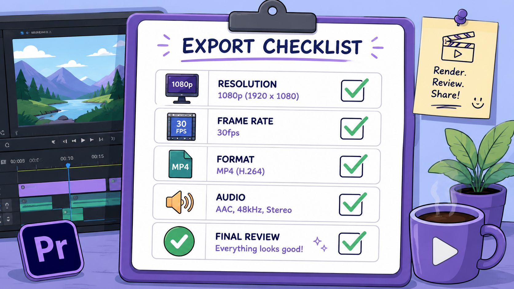
The safest baseline is still simple: export in a common delivery format, keep the encode clean, and match the file to the placement version you intend to run. This typically involves MP4, H.264, fixed frame rate, square pixels, progressive scan, and stereo AAC audio at 128 kbps or higher. Those settings are boring on purpose. Boring exports are easier to QC, easier to batch, and less likely to create upload surprises.
Export settings worth standardising
Set these as team defaults in Premiere Pro, Final Cut Pro, or whatever your editors use:
- Container: MP4 for the default handoff.
- Codec: H.264.
- Frame rate: Fixed.
- Pixel shape: Square pixels.
- Scan type: Progressive.
- Audio: Stereo AAC at 128 kbps+.
- Resolution: Export from the correct placement master. Do not stretch one master across every ratio and hope the preview holds up.
That last point causes more wasted spend than teams admit. A single “universal” export sounds efficient until text gets clipped in Reels, product framing breaks in Stories, or Feed versions look padded and cheap. Separate masters add a little production time upfront. They save review time, reduce placement mistakes, and protect test quality later.
Final checks before you hit publish
Use a short QC pass that catches placement and routing issues before they turn into live spend:
- Preview the asset in the actual placement. Editor previews miss UI overlap and crop behavior.
- Check safe zones for text, logos, and subtitles. Mobile interface elements will cover bad positioning.
- Confirm the filename tells the buyer what it is. Hook, angle, ratio, market, and version should be obvious.
- Check the source master before upload. Platform compression will not fix a weak export.
- Review the first seconds with audio off. A lot of impressions will be won or lost without sound.
Here's a useful walkthrough to pair with that checklist:
Clean exports do not create winners. They stop avoidable losers.
The teams that handle volume well do not rely on memory or taste for this stage. They use presets, naming rules, ratio-based export folders, and a repeatable QA checklist. Once that system is in place, automation starts paying for itself. Fewer manual decisions means fewer mismatched placements, faster launches, and cleaner test data. That is how specs stop being admin work and start protecting margin.
If your team is launching Meta campaigns at scale, Rapid Ads is worth a look for the operational side alone. It's built for bulk uploads, cleaner naming conventions, multi-account workflows, and reducing the manual friction that slows down high-volume creative testing.