
You're in Ads Manager looking at the same offer across multiple placements. Feed is holding CPA. Reels is spending but not converting. Stories has decent thumb-stop but weak post-click quality. The usual reaction is to blame the hook, audience, or bid strategy.
Sometimes the problem is simpler. You picked the wrong format container for the placement.
That's the part many buyers skip because “format” sounds cosmetic. It isn't. In Meta, format choice changes how the asset fits the placement, how much screen it occupies, what interaction pattern the user gets, and how much control you keep over reporting. A good creative in the wrong container can lose to an average creative that matches the placement better.
This guide is for buyers already running scale. You know ROAS, CPA, CTR, CBO, ABO, broad, LAL, retargeting. The useful question isn't what a Facebook ad is. It's when to use single image vs single video vs carousel vs collection vs Reels vs Stories vs Flexible Ads, and when bundling assets helps the auction versus when it destroys clarity.
I'm going to treat Meta ad formats the way a senior buyer uses them. As operational choices inside Ads Manager. Which container fits which placement. Which aspect ratio belongs where. When to separate ads for clean readouts. When to let Meta combine assets inside one unit. And how to launch all of that without creating naming chaos or letting Advantage+ creative settings drift.
Table of Contents
- Introduction Why Format Choice Makes or Breaks ROAS
- How Meta Ad Formats Work as Placement First Containers
- Every Meta Ad Format Explained With Capabilities and Best Use Cases
- Creative Specs and Placement Implications That Affect Delivery
- When to Choose Flexible Ads Versus Separate Single Format Ads
- Launching and Managing Formats at Scale Without Losing Control
- Conclusion Your Format Decision Framework for What to Test Next
Introduction Why Format Choice Makes or Breaks ROAS
A familiar scaling problem looks like this. The brand has one winning concept, usually a strong offer angle or UGC-style proof asset. The team cuts it once, uploads it broadly, and lets Advantage+ placements do the rest. Spend ramps. Feed carries performance. Reels and Stories absorb budget because inventory is there, but the creative doesn't really belong there.
The result isn't always obvious in top-line reporting. You still see delivery. You still see clicks. But at the placement level, some of that spend is going into a container that forces the asset to crop badly, pad awkwardly, or lose the full-screen behavior users expect in vertical environments.
Practical rule: If an ad works in Feed but falls apart in Reels, start by auditing the format and aspect ratio before rewriting the concept.
That's why format choice matters more than most account structures suggest. Buyers often treat format as a creative team decision. In practice, it's a media buying lever. It affects placement coverage, auction suitability, testing design, and whether your reporting tells you anything useful after launch.
Three account situations usually expose the issue fastest:
- Mixed-placement prospecting: You run broad or lookalike traffic across Feed, Stories, and Reels with one asset set, then wonder why spend shifts into low-conviction placements.
- Creative testing at volume: You upload many variants, but your naming and reporting don't separate single-image tests from multi-asset automation.
- Scaling catalogue or ecommerce accounts: You need to decide whether to preserve manual control or let Meta assemble and route creative combinations dynamically.
The fix isn't “always use video” or “always go vertical.” It's a decision framework. Match the ad container to the placement context. Then decide whether that container should hold one asset with tight control, or multiple assets with auction-driven selection.
How Meta Ad Formats Work as Placement First Containers
Most buyers learn formats as a menu inside the ad level. Single image, video, carousel, collection. That's technically fine, but it's the wrong mental model.
Meta formats make more sense if you think of them as placement-first containers. The placement comes first. The container is built around how that placement is consumed. Then your asset has to fit the container.
From feed-era units to mobile-native containers
Meta ad formats didn't appear as one clean system. They evolved into one. According to HY Digital's 2026 Meta format guide, the active set used by marketers includes single image, single video, carousel, collection, Reels, Stories, and Advantage+ catalog, with Reels and Stories standardised around 9:16 at 1080×1920 px, Feed commonly using 4:5 at 1080×1350 px, and Carousel commonly using 1:1 at 1080×1080 px.
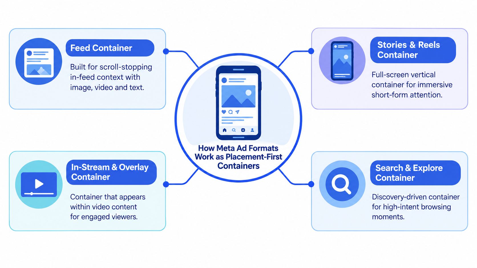
That progression matters because it explains why old one-size-fits-all creative breaks at scale. Feed-era logic tolerated general-purpose assets. Mobile-native placements don't. Reels and Stories expect immersive vertical coverage. Feed still behaves more like a scrolling shelf where stopping power and readable framing matter more than full takeover.
A good analogy is a store window. You're selling the same product, but the front window, the aisle endcap, and the checkout display all require different packaging. The offer may stay constant. The container doesn't.
What the auction is really evaluating
The auction doesn't just evaluate your message in a vacuum. It evaluates a creative unit inside a placement environment. That environment influences what can render well, what users are used to engaging with, and how much of the screen your ad gets.
That's why a format decision usually answers four separate questions:
- Where will this ad appear most naturally
- What aspect ratio fits that placement
- How many assets should sit inside the ad unit
- How much control do I need over what gets shown
Reels and Stories aren't “just video placements.” They are full-screen vertical containers with their own consumption pattern.
Once you see formats this way, account structure gets cleaner. Feed creative isn't a weaker version of vertical creative. It's a different container solving a different job. Carousel isn't just “more cards.” It's a swipe-driven container. Collection isn't just a pretty layout. It's a storefront bridge.
Every Meta Ad Format Explained With Capabilities and Best Use Cases
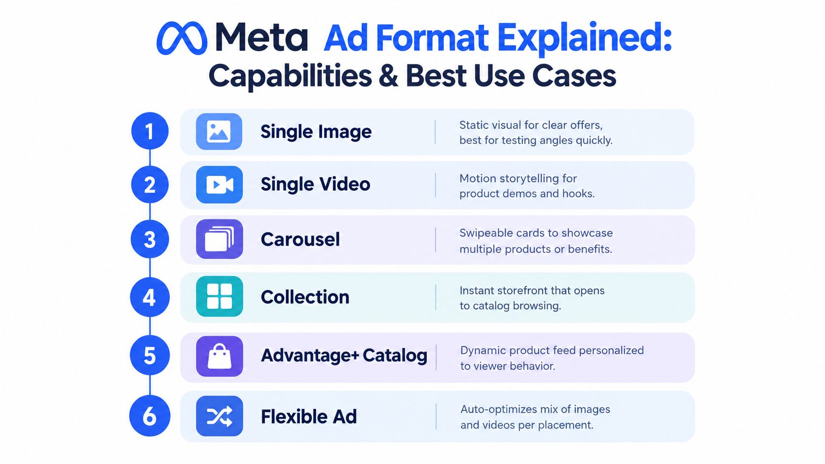
The useful way to compare Meta ad formats is by asking what each one lets the user do, what level of message control you keep, and where it fits in the funnel.
Single image and single video
Single image is still the cleanest format for angle testing. One frame. One message hierarchy. Minimal ambiguity in readouts. If I'm testing offer framing, price anchoring, or a product-led retail visual, single image is usually the fastest way to isolate whether the concept has merit.
Single video does more work when the sale requires demonstration, transformation, or pacing. It's not automatically better. It just gives you motion, sequencing, captions, and audio logic. The tradeoff is looser diagnosis. If the ad fails, was it the hook, the pacing, the first scene, or the offer?
A simple operational split:
- Use single image when the message can land in one frame
- Use single video when motion explains the value better than static
- Separate them in testing when you need format-level clarity
Carousel and collection
Carousel works when the sale benefits from progression. Multiple SKUs. Before-and-after steps. Several value props. Different objections answered card by card. It's still one ad, but the interaction is swipe-based, so you're asking the user to opt into the next frame.
That means the first card carries disproportionate importance. If card one doesn't earn the swipe, the rest of the sequence is wasted.
Collection is a stronger fit when you want a storefront experience. Hero asset on top, product discovery below. Buyers often use it when the account has enough catalogue depth that browsing behavior itself is valuable, not just the initial click.
Later in the workflow, many teams pair collection-style thinking with catalogue setups rather than standalone hero-only ads, especially in ecommerce.
To ground the basic format mechanics, this walkthrough is useful:
Stories and Reels
Stories and Reels both live in the vertical, full-screen family, but they don't behave identically.
Stories sit in a tap-through environment. Attention is quick, and the ad has to feel native to interruption-based viewing. Time-sensitive offers, direct CTAs, and simple visual hierarchy tend to fit.
Reels sit in a browsable short-form environment. The ad competes more directly with entertainment pacing and creator-style consumption. That usually means stronger hooks and a more native video rhythm.
Buyer heuristic: If the concept relies on reading and static proof, start in Feed. If it relies on movement and interruption, cut a vertical version for Stories or Reels.
Advantage+ catalog and Flexible Ads
Advantage+ catalog is a feed-powered format. It's strongest when the product feed itself is a major part of the ad system, especially for dynamic product selection and merchandising.
Flexible Ads solve a different problem. Meta's developer documentation explains that flexible ad format is a multi-asset setup for Sales and App Promotion campaigns that groups related assets inside one ad and can be used without first selecting a fixed ad format (Meta developer documentation on flexible ad format). Metricool also notes that Meta can choose whether to show the ad as a single image, video, or carousel based on predicted performance for the audience and placement (Metricool's explanation of Flexible Ads in Meta).
That means Flexible Ads aren't another creative style. They're a delivery logic. You upload a set of related assets. Meta decides which container version to show.
Creative Specs and Placement Implications That Affect Delivery
Specs aren't a design checklist. They affect delivery quality. If the asset shape doesn't fit the placement shape, Meta has to improvise. That usually means cropping, padding, or reducing how immersive the ad feels.
The core placement ratios
For vertical placements, common production guidance is 9:16 at 1080×1920 px for Stories and Reels, while Feed inventory typically uses 4:5 at 1080×1350 or 1:1 at 1080×1080 (Superscale's Meta ad sizes reference).
That's why a single master creative rarely travels cleanly across all placements. A square can survive in Feed. It won't own the screen in Reels. A tall vertical asset can work beautifully in Stories, then frame awkwardly in some feed contexts if the composition wasn't planned for mixed use.
Here's the simplest working spec table for buyers planning creative batches:
| Format Placement | Recommended Ratio | Resolution | Best For |
|---|---|---|---|
| Feed image or video | 4:5 | 1080×1350 | Scroll-stopping mobile feed coverage |
| Feed mixed-use baseline | 1:1 | 1080×1080 | Broad compatibility and simpler re-use |
| Stories | 9:16 | 1080×1920 | Full-screen vertical interruption |
| Reels | 9:16 | 1080×1920 | Native short-form consumption |
| Carousel | 1:1 | 1080×1080 | Multi-card product or message sequencing |
Is square becoming obsolete
Not quite. But it's no longer the default answer many teams still treat it as.
Recent coverage shows Meta now recommends 4:5 for feed images and 9:16 for video, and one 2026 guide reports that 9:16 video in Feed had 7% higher CTR than square in its cited comparison (1 Click Report's guide on creative safe zones and format performance). The broader point isn't that square never works. It's that taller formats often claim more visual real estate and align better with current mobile behavior.
So where does 1:1 still make sense?
- Cross-placement testing: when you need one controlled baseline
- Carousel: where square card consistency is operationally cleaner
- Production-constrained teams: when speed matters more than placement perfect-fit in an early test
Square still has a role. It just shouldn't be your unexamined default.
The mistake is using 1:1 because the team always has. The stronger move is to decide whether you're optimising for compatibility or for placement-native coverage.
When to Choose Flexible Ads Versus Separate Single Format Ads
This is the decision that is handled inconsistently. They know Flexible Ads exist, but they don't have a rule for when to bundle assets and when to split them apart.
What Flexible Ads are good at
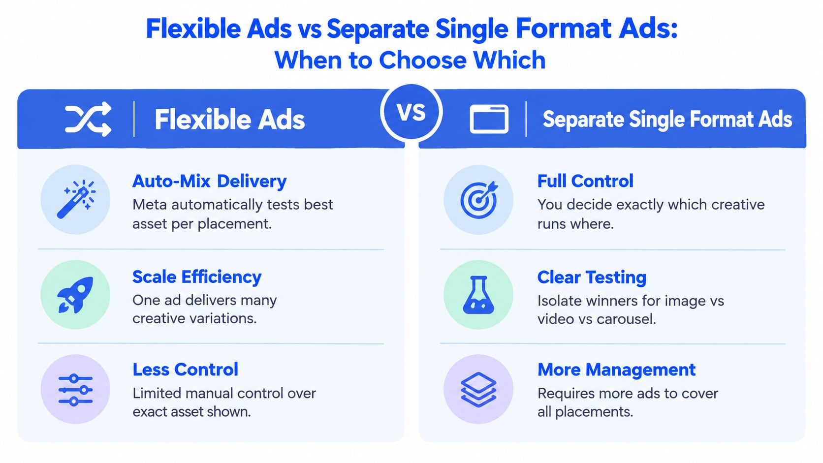
Flexible Ads are useful when you have related assets and want the auction to assemble the best presentation. Meta can test combinations inside one ad unit instead of forcing you to launch separate image, video, and carousel ads one by one.
Independent 2026 coverage also notes that Meta now has several distinct format options and that video made up 50.8% of new Meta ad creatives in 2026, up from 38.6% in 2025 (Adgenz's 2026 ranking of Facebook ad creative formats). That makes the operational question more important, not less. As more teams produce image and video variants simultaneously, bundling can reduce upload friction and creative fragmentation.
Use Flexible Ads when these conditions are true:
- You're in Sales or App Promotion: that's where the format is designed to operate
- The assets express the same core concept: different cuts, different proof angles, same strategic message
- You want placement adaptation without building many manual ads
- You can tolerate less deterministic reporting at the exact displayed-asset level
When separate ads are better
Separate ads are still the better choice if your job is diagnosis, not just throughput.
If you need to know whether image beat video, or whether the carousel structure itself drove the result, keep the ads separate. The same goes for high-stakes launches where creative intent matters. If legal copy, offer sequencing, or brand framing must appear exactly as built, don't hand too much assembly logic back to the platform.
A practical matrix:
| Situation | Better Choice | Why |
|---|---|---|
| Early concept testing | Separate ads | Clean read on format-level winners |
| Scaling proven angle across placements | Flexible Ads | Less fragmentation, faster variation deployment |
| Strict reporting by creative type | Separate ads | Easier breakdown and post-test learning |
| Large asset bank with one offer family | Flexible Ads | Lets Meta mix image, video, or carousel delivery |
| Sensitive sequencing or narrative | Separate ads | Preserves exact intended user experience |
If the question is “what concept wins,” separate the ads. If the question is “how do I let Meta find the best packaging for this concept,” bundle them.
Launching and Managing Formats at Scale Without Losing Control
At low volume, format management is annoying. At high volume, it becomes a systems problem. The account doesn't usually break because your team lacks ideas. It breaks because setup gets inconsistent.
Build naming around the decision you need later
A practical naming convention for scaled workflows uses a structure like [Campaign Type] | [Audience] | [Creative Concept] | [Variation ID] | [Date], while campaign and ad set names can also encode objective, budget tier, placement, and audience size for cleaner reporting and bulk operations (Instrumnt's guide to Meta ads automation and bulk upload naming).
That matters because format testing creates reporting clutter fast. If the ad name doesn't tell you whether the unit was Feed-first, vertical-first, or a flexible bundle, your analysis slows down immediately.
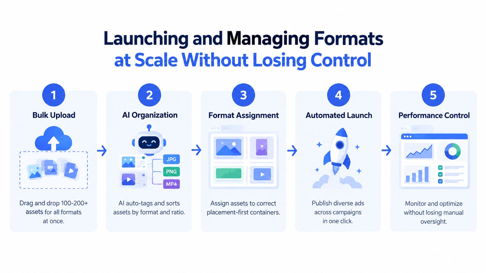
A clean workflow usually looks like this:
- Sort assets by intended container. Feed static, feed video, vertical video, carousel card sets, catalogue-linked assets.
- Name for readback, not just upload. Put concept and variation ID where breakdown exports stay interpretable.
- Use separate ad sets only when the placement logic differs. Don't create structure for its own sake.
- Batch-launch with placement fit in mind. Mixed ratios need routing discipline or they'll land in the wrong place.
Keep Advantage+ creative from drifting
One overlooked issue is enhancement drift. Meta Advantage+ creative enhancements are configured at the ad level, and available controls include a master toggle to turn off all optimisations at once or individual switches for specific enhancements. One source also notes that account-wide defaults can be adjusted in Advertising settings to stop future ads being auto-enrolled (Volume Creatives on turning off Advantage+ enhancements).
There's also a bulk workflow. In the Ads tab, you can select multiple ads, open the edit dropdown, choose Creative setup, and turn off selected Advantage+ creative features before publishing the batch (Privyr's walkthrough of Meta Advantage creative features).
That's one of the few places a specialised launch tool can make a real operational difference. Rapid Ads is built around bulk uploads, custom naming conventions, multi-account management, and keeping Advantage+ creative enhancements disabled while also handling mixed-ratio routing and Flexible Ads setup inside one workflow. That's useful when Ads Manager itself becomes the bottleneck rather than strategy.
Conclusion Your Format Decision Framework for What to Test Next
The simplest way to think about Meta ad formats is this. Start with the placement, then choose the container, then decide how much control you want.
If the placement is Feed, build for Feed. If it's Stories or Reels, treat vertical full-screen as a different job, not a resize request. If the concept needs one clean read, run separate ads. If the concept is already proven and you want Meta to package related assets more efficiently, Flexible Ads become more attractive.
A short Monday-morning checklist:
- Prospecting: test single image or single video in Feed, plus a native vertical cut for Stories or Reels
- Retargeting: use carousel or catalogue-driven formats when sequence or product depth helps the sale
- Creative iteration: keep formats separate while diagnosing winners
- Scale phase: bundle related assets only when reporting clarity matters less than operational speed
- Account audit: check where square assets are still being used by habit rather than by choice
Most format problems don't show up as obvious setup errors. They show up as “good creative” that mysteriously underdelivers in the wrong placement. Fix the container first. Then judge the concept.
If format testing is slowing down because Ads Manager turns every mixed-ratio launch into manual sorting, Rapid Ads is worth looking at. It handles bulk uploads, naming structure, Flexible Ads setup, multi-account workflows, and Advantage+ auto-disable in one place, which is exactly where format-heavy Meta ad operations usually start leaking time and control.
